나홀로 데이터 분석가의 1인 연구실
[시각화] matplotlib 공통 함수 본문
0-1. 도입
개인적으로 시각화를 할 때 가장 많이 사용해온 matplotlib의 공통 파라미터들을 정리하고자 합니다.
matplotplib은 기본적으로 도화지 위에 그림을 쌓는 개념이라고 생각하시면 됩니다.
import matplotlib.pyplot as plt

%matplotlib inline- %matplotlib inline: 시각화 자료를 현재 코드 안에서 바로 출력하게 해주는 명령어
matplotlib에서 가장 많이 사용하는 요인은 <그림1>과 같습니다.

0-2. 학습 환경
- matplotlib: 3.3.4
- seaborn: 0.11.1
금일 학습에는 seaborn 라이브러리에서 제공하는 penguins 데이터를 사용하고자 합니다.
seaborn에서 제공하는 다른 데이터셋은 '.get_dataset_names()'를 통해 확인이 가능합니다.
import seaborn as sns

sns.load_dataset('penguins')

#다른 데이터셋을 확인하고자 할 때
sns.get_dataset_names()

1. matplotlib의 공통 함수
- figure: 도표 배경
- title: 도표 제목
- label: x축, y축 이름
- ticks: x축, y축 눈금
- lim: x,축, y축 범위
- grid: 눈금선
- legend: 범례
위 함수들은 제가 주로 사용하는 것들이고, 그 외에도 많은 것들이 있습니다.
1-1. 도표 배경
- figsize를 통해 x축과 y축의 길이를 조정할 수 있습니다.
- faceclor를 통해 뒷배경의 색을 설정할 수 있습니다.
- 그 외에 잘 쓰지는 않지만, dpi, frameon, edgecolor 등의 여러 파라미터도 존재합니다.
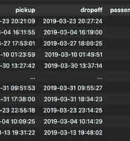
plt.figure(figsize=(12,12), facecolor = 'grey')

plt.scatter(1,2)

plt.show()
1-2. 도표 제목
- label을 통해 제목을 입력할 수 습니다.
- size와 color를 통해 글자 크기와 색상을 설정할 수 있습니다.
- loc를 통해 제목의 위치를 변경할 수 있습니다(left, center, right).
plt.figure(figsize=(12,12))

plt.title(label = 'Example of Title', size = 30, color = 'red', loc = 'left')

plt.scatter(1,2)

plt.show()
1-3. 축 이름
- (x, y)label을 통해 제목을 입력할 수 습니다.
- size와 color를 통해 글자 크기와 색상을 설정할 수 있습니다.
- loc를 통해 제목의 위치를 변경할 수 있습니다(x: left, center, right / y: bottom, center, top).
plt.figure(figsize=(12,12))

plt.scatter(1,2)

plt.xlabel(xlabel = 'X Axis', size = 30, color = 'red', loc = 'right')
plt.ylabel(ylabel = 'y Axis', size = 30, color = 'blue', loc = 'bottom')

plt.show()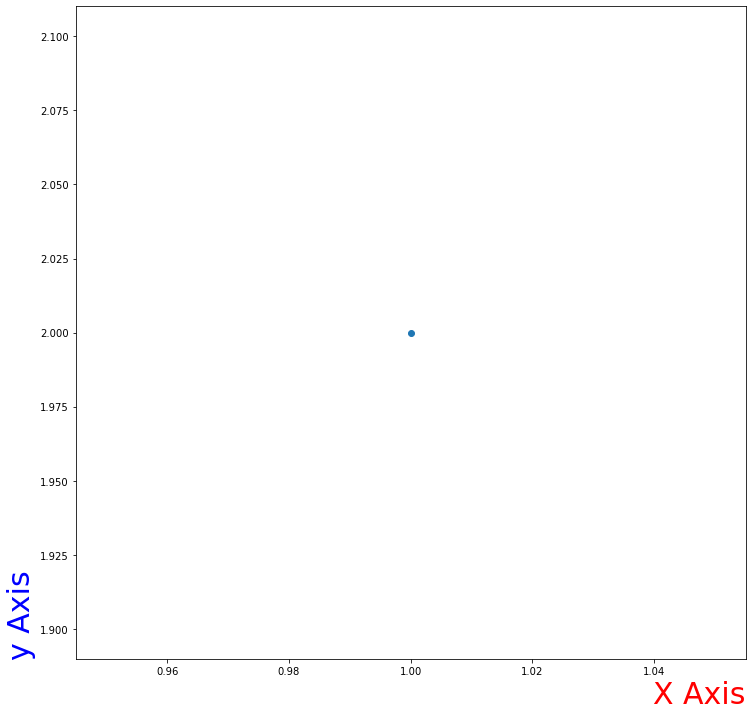
1-4. 축 눈금
- ticks를 통해 눈금 표시를 지정할 수 있습니다.
- label을 통해 눈금 이름을 입력할 수 습니다.
- size와 color를 통해 글자 크기와 색상을 설정할 수 있습니다.
plt.figure(figsize=(12,12))

plt.scatter(2,2)

plt.xticks(ticks = [1,2,3], labels = ['A', 'B', 'C'], size = 30, color = 'red')
plt.yticks(ticks = [1,3], labels = ['D', 'E'], size = 30, color = 'blue')


plt.show()
1-5. 축 범위
- 튜플 형태를 통해 눈금 범위를 지정할 수 있습니다.
plt.figure(figsize=(12,12))

plt.scatter(2,2)

plt.xlim((0,10))
plt.ylim((0,10))

plt.show()
1-6. 눈금선
- linestyle을 통해 선의 표시 형태를 변경할 수 있습니다.
- linewidth와 color를 통해 선의 두께와 색상을 설정할 수 있습니다.
- alpha를 통해 투명도를 조절할 수 있습니다.
plt.figure(figsize=(12,12))

plt.grid(color = 'red', linewidth = 3, linestyle='--', alpha= 0.2)

plt.scatter(2,2)

plt.show()
1-7. 범례
- labels를 통해 범례 내 표시명을 지정할 수 있습니다(순서는 그래프 그린 순서대로).
- fontsize를 통해 글자 크기를 조절 할 수 있습니다.
- ncol를 통해 열의 개수(1줄, 2줄 등)를 변경 할 수 있습니다.
- loc와 facecolor를 통해 범례의 위치와 배경색상을 변경할 수 있습니다.
plt.figure(figsize=(12,12))

plt.scatter(2,3)
plt.scatter(2,2.5)

plt.legend(labels = ['Blue Dot', 'Red Dot'], loc = 'upper left', ncol = 2, fontsize = 15, facecolor = 'grey')

plt.show()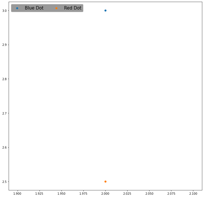
2. 함수 종합 사용
x1 = df.groupby('sex').get_group('Male')
x2 = df.groupby('sex').get_group('Female')


plt.figure(figsize=(12,12))

plt.title('Penguins: Male vs. Female', size = 30)

plt.scatter(x1.bill_length_mm, x1.bill_depth_mm, s = 70, marker = 'o', alpha = 0.5)
plt.scatter(x2.bill_length_mm, x2.bill_depth_mm, s = 70, marker = 'x')

plt.xlabel("Penguins' Length", size = 15)
plt.ylabel("Penguins' Depth", size = 15)

plt.grid(linestyle = '--')

plt.xticks(size = 15)
plt.yticks(size = 15)

plt.legend(['Male', 'Female'], fontsize = 13, shadow=True)


plt.show()
plt.figure(figsize=(12,12))

plt.title('Where the Penguins Came From?', size = 20)

plt.bar(range(3), df.island.value_counts().values, color = 'grey', linewidth = 2, hatch = '/', alpha = 0.5)
plt.xticks(range(3), df.island.value_counts().index, size = 15)
plt.yticks(size = 15)

plt.show()
끝으로, matplotlib은 위에서 소개한 것 외에도 수많은 함수와 파라미터들이 존재합니다.
더많은 정보는 아래 matplotlib 홈페이지에서 직접 검색해보시면 좋을 것 같습니다.
https://matplotlib.org/stable/index.html
Matplotlib documentation — Matplotlib 3.6.2 documentation
Matplotlib 3.6.2 documentation Matplotlib is a comprehensive library for creating static, animated, and interactive visualizations in Python. Installation Install using pip: Install using conda: Further details are available in the Installation Guide. Lear
matplotlib.org
'Python > Theory' 카테고리의 다른 글
| [시각화] plt.scatter()를 활용한 산점도 그리기 (0) | 2023.01.02 |
|---|---|
| [Python] 데이터 전처리를 위한 apply(lambda)문 사용하기 (0) | 2022.12.28 |
| [Python] tqdm을 통해 for, apply문 진행율 확인하기 (0) | 2022.12.27 |
| [Python] 라이브러리 설치 시 [WinError 5] 에러 대처하기 (0) | 2022.12.27 |
| [웹 크롤링] find_all 함수로 웹 페이지 내 Element 추출하기 (0) | 2022.12.26 |